

Colour Rendering Index (CRI): Why Two Lights Can Look Completely Different
- Jul 31
- 3 min read
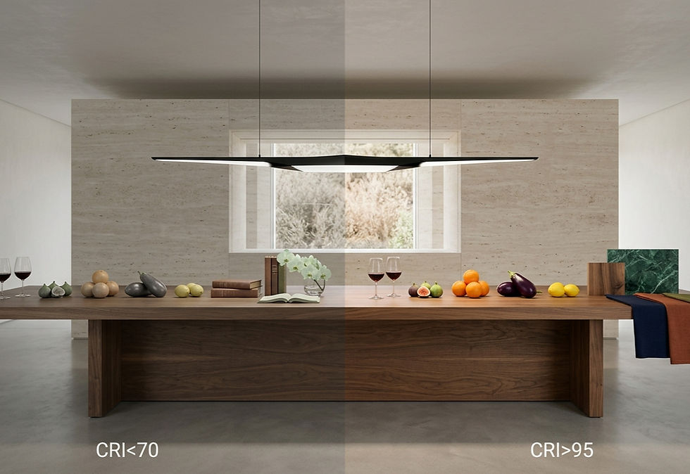
Walk into a luxury boutique, and the fabrics seem rich, the leather looks premium, and every colour feels vibrant. Walk into a poorly lit store, and the very same products can appear dull, flat, and uninspiring.
What changed?
Not the products.
Not your eyes.
Just the quality of light.
That difference is largely explained by Colour Rendering Index (CRI).
What is CRI?
Colour Rendering Index, commonly known as CRI, measures how accurately a light source reveals the true colours of objects compared to natural daylight.
Think of CRI as the honesty of a light source.
A high-CRI light shows colours as they really are.
A low-CRI light distorts them.
Two luminaires can produce exactly the same brightness, yet one makes a red sofa look luxurious while the other makes it appear faded and lifeless.
Brightness Doesn't Mean Better Colour
This is one of the biggest misconceptions in lighting.
People often assume that if a light is brighter, colours will naturally look better.
They won't.
Brightness (lumens) tells you how much light is produced.
CRI tells you how well that light reveals colours.
A very bright, poor-quality LED can still make food look unappetizing, artwork look dull, and interiors feel artificial.
Why Does This Happen?
Every light source produces its own spectrum of light.
Natural sunlight contains a continuous spectrum, which is why colours appear balanced and natural outdoors.
Some artificial light sources, especially inexpensive LEDs, emit an incomplete spectrum.
When certain wavelengths are missing, some colours cannot be reflected properly.
The result?
Reds lose their richness.
Greens become muted.
Skin tones appear unhealthy.
Timber loses warmth.
Fabrics look lifeless.
Marble and stone lose their natural character.
The objects haven't changed.
Only the light has.
A Simple Experiment
Imagine placing a bowl of fresh fruit beneath two different lights.
Under the first light:
Strawberries appear vibrant.
Lemons glow naturally.
Green apples look fresh.
Grapes display subtle colour variations.
Under the second light:
The same fruit suddenly looks dull.
Nothing seems appetizing anymore.
Both lights may produce identical brightness.
Only one reproduces colour faithfully.
That's CRI in action.
Why Architects Care About CRI
Architects don't choose lighting simply to make a room visible.
They use light to reveal materials exactly as they were intended to be experienced.
Premium architecture relies heavily on subtle material qualities.
Consider:
The warm grain of walnut.
The veins inside Carrara marble.
The richness of brass.
The softness of linen.
The depth of natural stone.
The texture of handmade ceramics.
Low-quality lighting hides these details.
High-CRI lighting celebrates them.
This is why luxury hotels, designer residences, museums, art galleries, premium retail stores, and high-end restaurants almost always specify high colour rendering.
Where High CRI Matters Most
Some environments simply cannot compromise on colour accuracy.
These include:
Luxury residences
Retail showrooms
Fashion boutiques
Jewellery stores
Museums and galleries
Restaurants
Hotels
Healthcare facilities
Photography studios
Beauty salons
Kitchens
Interior design studios
Whenever colour influences emotion, purchasing decisions, or visual comfort, CRI becomes important.
Is CRI Everything?
Not anymore.
While CRI is still widely used across the lighting industry, it isn't perfect.
It evaluates only a limited set of test colours and doesn't fully describe how modern LED lighting reproduces the entire visible spectrum.
Today, professional lighting designers often look beyond CRI and also consider advanced metrics such as TM-30, which provides a much more comprehensive understanding of colour fidelity and colour preference.
However, CRI remains one of the simplest and most useful indicators when comparing lighting products.
What CRI Should You Choose?
As a general guideline:
CRI | Typical Quality | Suitable Applications |
Below 80 | Basic colour reproduction | Warehouses, utility spaces |
80–89 | Good | Offices, classrooms, commercial spaces |
90–95 | Excellent | Homes, hotels, restaurants, premium retail |
95+ | Exceptional | Museums, luxury interiors, galleries, high-end displays |
For premium architectural projects, specifying CRI 90 or higher is generally considered best practice.
The Real Takeaway
Great lighting isn't just about making a space brighter.
It's about revealing architecture, materials, artwork, furniture, food, fabrics, and people exactly as they deserve to be seen.
A beautifully designed interior can lose much of its impact under poor colour rendering.
On the other hand, a high-quality luminaire with excellent CRI allows every surface, texture, and finish to express its true character.
Because in the end, light doesn't create colour—it reveals it.


Comments